Key takeaways
- A usable logo works small, in one color, and next to a name. Use is the test. Taste is not.
- Start from the name and the places it will live. Test a favicon and a one-color stamp before you design a billboard.
- The mark is not the brand system. Hand someone else a kit they can apply without guessing.
The new mark looks expensive on the wide homepage hero. It dies in the browser tab. It turns to mud on the packing slip. The printer asks which color to drop, and there is no answer.
A logo for a small business is not a mood-board contest. It has to work small, in one color, and next to a name. Taste is not the test. Use is the test. A mark that only looks expensive on a wide desktop hero is not a logo. A gradient that dies in a stamp is not a logo. A symbol that cannot sit beside the company name without fighting it is not a logo.
The mark has to survive a favicon, a one-color invoice, a hat, a listing photo, and a header next to six words of type. If it fails any of those, it is decoration.
Design for the smallest place it will live
A logo is a mark people can recognize and reproduce. Simple enough to hold at 16 pixels. Clear enough in a single ink. Quiet enough to sit beside the name without becoming a second headline.
It is not a brand. It is not a story. It is not a system. Branding is the system around the mark — type, color, rules, the next ten assets. The mark is one piece. Treat it as the whole identity and you will keep redesigning it every time a new channel appears.
A billboard mark is a detailed illustration. It fails at 16px. A full-color-only drawing is a gradient hero. It fails in one ink. A symbol that fights the name is two headlines. A usable logo is small, one color, next to the name. Use decides. Taste does not.
Most logos start in a generator. Someone pastes a vibe and hopes a mark will appear once the curves look expensive. The preview can look finished. The business still cannot put the file on a van.
Write the name. Write the places it has to live this year: the site header, the tab icon, the email signature, the proposal cover, the social avatar, the stamp on a packing slip. If you cannot name those places, do not draw yet. You will design for a billboard you do not own.
A logo design guide that starts with "find your spirit animal" is selling taste. A guide that starts with the header and the favicon is selling use. Design the smallest honest container first. Then see if the same drawing still works when it is allowed to be large.
One ink before any palette
A logo that only works in full color is a liability. It will meet a receipt printer, an embroidered cap, a newspaper listing, a single-color social highlight, a late-night photocopy. Those surfaces do not care about your gradient.
Design the one-color version first. Black on white. White on black. One ink on a cheap substrate. If the mark collapses without a second color, it was never a mark. It was a rendering.
Color can come after. Color is part of the kit, not a crutch for a weak drawing. A logo that works in one color can take a palette. A logo that needs a palette cannot take a stamp.
Print it on a packing slip. Fax it. Embroider a sample. If you cannot do those tests this week, shrink it to a black square on a white page and hold it at arm's length. That is the invoice test.
The five-file handoff test
Before approving the drawing, ask the designer to hand the identity to someone who did not attend the project. That person should be able to produce five ordinary outputs without guessing:
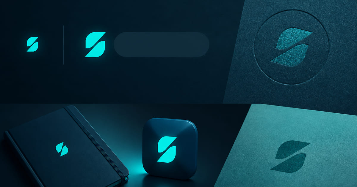
1. A vector master for print and fabrication. 2. A one-colour version that works without gradients or effects. 3. A reversed version for dark backgrounds. 4. A horizontal or stacked lockup with the business name. 5. A small square asset for an avatar or favicon.
The test is not whether the folder contains five files. It is whether each file has a named job. “logo-final-7.png” is not a system. “mark-one-colour.svg” is.
Add a sixth document only when it prevents a real mistake: a one-page usage sheet showing minimum size, clear space, approved colour values, and two or three prohibited treatments. Do not turn the handoff into a 70-page mythology book when the next user is a sign printer who needs the vector and the ink.
Rights require a separate check. Copyright and trademark are not interchangeable. The U.S. Copyright Office deals with original visual expression; the USPTO deals with marks used to identify the source of goods or services. A designer can deliver excellent files without clearing the name or mark for registration. Search and legal review belong in the scope when they matter.
Use this approval sentence: another competent person can reproduce the identity correctly from the files alone. If that sentence is false, the project is not finished. The mark may be attractive. The handoff is still fragile.
See USPTO — Strong trademarks and U.S. Copyright Office — Visual arts.
Shrink it until it breaks
The favicon is the honest test. Sixteen pixels. No caption. No second color to explain the idea. If a stranger cannot tell it is a mark — not a smudge — the drawing is too busy.
The same test applies to an app icon, a map pin, a profile circle, a watermark. Complexity that looks "premium" at 800 pixels becomes noise at 32. Detail is not craft. Craft is what survives reduction.
Draw it large if you want. Then shrink it until it breaks, and fix the break. Repeat. A logo for a small business will spend most of its life small. Design for that life.
Favicon and invoice before billboard. The billboard is the easy size. Almost any drawing looks intentional at six feet.
Lock the mark to the name
A mark that cannot sit beside the name is a second brand. The lockup is the default: symbol plus word, one line or a tight stack, enough space that neither shouts.
Some businesses only need a wordmark. That is a legitimate logo. A name set well, in a weight that holds at small sizes, in a cut you can license, is often more usable than a symbol invented to look like a brand. Add a symbol when it earns the space — when it still reads without the name, and still behaves when the name returns.
Do not force a symbol because a template had a square for one. Empty space next to a clear name is not unfinished. A crowded lockup is.
Visual storytelling is the pictures the mark sits on. A sharp logo next to a rented handshake is still two companies. The mark has to live with the photographs, not fight them.
The drawing is not the whole identity
This is where teams waste a year. They treat the logo as the identity, then argue about every new asset because there are no rules. The next freelancer picks a different blue. The next deck uses a different type. The mark starts getting a drop shadow "so it pops."
A logo and branding kit is the identity you can hand to someone else: the mark in the formats you will actually use, a short palette, a type pairing, and the few rules that stop the next ten files from drifting. Branding is that system applied — web, decks, social, the presence a stranger meets.
You do not need an 80-page book. You need enough rules that two people can make the next asset without a taste argument. A single logo file is enough only while one person is the brand. The moment a contractor, a printer, or a second founder touches a file, drift starts.
When you need a brand kit is the same question: can someone else apply this without guessing?
Hand someone else a kit they can use
A request queue can return a logo. A prompt can return a logo. Neither owns the places the mark has to live.
A design subscription is a board. You write a card. A mark comes back. You still have to decide the lockup, the one-color version, the favicon, the type, and whether the next landing page is allowed to recolor it. The queue did a graphic. The identity is still yours to finish.
DIY AI is faster at the same unfinished job. It will give you a detailed emblem that looks expensive in the preview and dies in the tab. It will invent a symbol that cannot sit next to the name. It will not tell you the drawing failed the stamp test. You still spend the evenings. You can still end up with a folder of strong-looking files and a presence that is not one company.
Those paths are fine when you already have a system and need another file. They fail when the brief is still "we need a logo" and nobody has named the header, the ink, or the tab.
We have set identities since 2014: more than twelve years, more than fifty businesses, more than a hundred websites. The logo and branding kit is the identity: a mark that works small, in one color, next to the name — plus the few rules that keep the next assets honest. Branding is the system when the work is larger than a kit.
Print the mark on a packing slip. If it dies there, it was never done. Start a scoped proposal when you want the identity, not just the next file.