
Key takeaways
- Frequency earns a visible slot. Tasks people do every visit should not live behind the same icon as legal links.
- Hiding the map costs completions. If the menu is the only way to buy, you taxed the sale.
- Test with a thumb at 200% zoom — not a cursor on a desktop emulator.
They opened the menu twice, could not find pricing, and left.
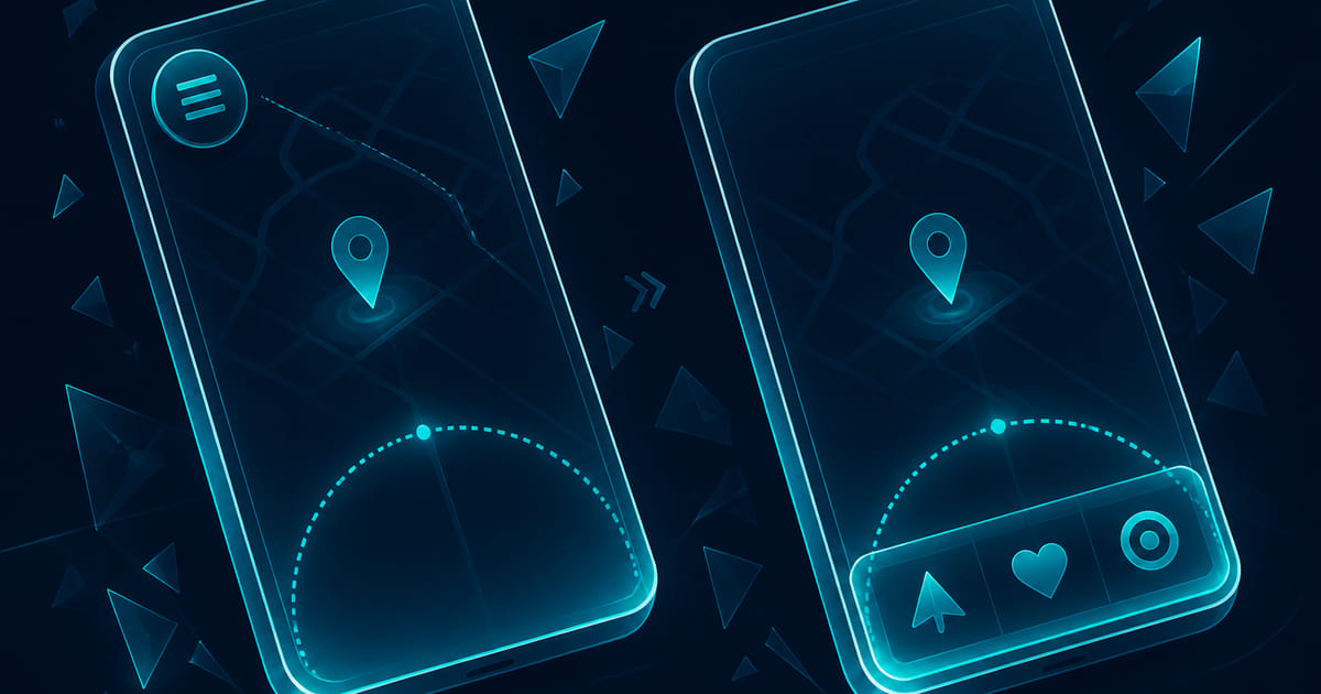
The site looked modern. One icon controlled everything — services, about, blog, careers, login, and the quote button. That is mobile navigation best practices inverted: every task paid the same toll to discover the map. High-frequency jobs went behind the same hatch as footer links nobody taps.
Navigation is not decoration. It is how a thumb finds the business. Hide the map and you hide revenue.
Run the thumb test right after you name the jobs
Use this before you pick a pattern — expertise articles need the test early.
1. Load the page on a phone you actually carry — not only Chrome device mode. 2. Set zoom to 200% and repeat. If the primary action leaves the thumb zone, the layout fails real users. 3. Without scrolling, count taps to reach: primary offer, proof, contact, and the top three tasks from analytics. 4. Time ten strangers. If nobody finds pricing in two taps, the pattern is wrong — not the user.
Record pass or fail. A beautiful hamburger that fails step four is a conversion leak, not a style choice.
W3C's Understanding Reflow is a useful companion: content must remain usable without horizontal scrolling at high zoom. Navigation that only fits at 100% zoom is already excluding people.
Rank tasks by frequency, not org chart
List what visitors actually do — from analytics, sales calls, and search queries — not from your internal departments.
| Frequency | Belongs | Pattern |
|---|---|---|
| Every visit | Quote, shop, book, login | Visible bar, FAB, or persistent CTA — not buried |
| Often | Services, locations, support | Top level or one tap from home |
| Sometimes | About, careers, blog index | Menu or footer is fine |
| Rare | Legal, privacy, accessibility statement | Footer |
How to structure a homepage is the desktop version of the same ranking: the first screen carries the job. Mobile nav is how that job survives when the header shrinks.
Creating a mobile-friendly website adds performance and form usability. Navigation is the other half of the thumb story — can they reach the next step without opening a drawer?
Compare patterns by cost, not fashion
Tab bar (bottom) — Best when three to five tasks repeat. Expensive in engineering if the CMS was not built for it. Cheap in user attention.
Priority+ pattern — Show the top links; overflow the rest. Good for marketing sites with one clear offer plus depth.
Hamburger / drawer — Fine for infrequent tasks. Deadly when it hides the primary sale.
Hybrid — Persistent CTA plus drawer for depth. Common fix for service sites that over-stuffed the header.
The hamburger menu cost is measured in discovery time, not pixels. NN/g's research on hidden navigation consistently shows lower findability when primary paths move off-screen. Use a drawer — do not make it the only map.
Do not hide the business behind one icon
Signs you taxed the sale:
- Pricing only appears inside a menu panel
- The quote button shares a row with six text links
- Login and "Contact" look identical at a glance
- New visitors must scroll the drawer to learn what you sell
Repair is usually cheaper than rebuild: pull the top two tasks out, promote the CTA, demote legal to footer, rename labels so they match buyer language — not internal slide titles.
Measure navigation like a funnel step
Treat nav like a form field:
- Click heatmaps on menu open vs direct tab taps
- Exit rate on pages reached only via drawer
- Search box queries that mirror nav labels — a sign the map failed
- Support asks that begin "I couldn't find ___ on your site"
- Session recordings on mobile where users scroll the header hunting for a label
If conversion repair is the job, nav belongs in the first audit pass — before new photography or a rebrand. A/B testing nav labels is cheap compared to losing paid traffic to a drawer.
Labels should match buyer language
Internal org charts make bad menu copy. "Solutions" hides pricing. "Resources" hides the blog your SEO depends on. Rename to the words people type in search and support tickets — quote, pricing, book, login, parts — even if the board deck uses different nouns.
Sticky headers that shrink on scroll can push the primary CTA below the thumb zone. Test scroll states in the thumb pass, not only the first paint. A visible quote button at load that hides after scroll is a pattern that looks clever in a mockup and fails in a parking lot.
What you can fix in a day — and what needs a redesign
You can run the thumb test, promote high-frequency links, and rename menu items to match buyer jobs. You can move pricing and contact out of the drawer.
What stays unfinished is a nav system tied to the CMS: tab bars that editors can update, priority rules that survive new pages, and a full website launch with QA on real devices. Web design and web development share that brief when mobile is how most people meet you.
CLICK.BLUE has repaired and rebuilt mobile paths since 2014 — more than fifty businesses, more than a hundred websites. If the menu is the moat around your offer, get started with the frequency list and the thumb test results in hand.