
Key takeaways
- Interface colour is semantic roles mapped to values — not a poster palette copied into CSS.
- Contrast-safe pairings are a ship gate. A brand blue is not automatically a text colour.
- Dark mode is a second mapping, not an inverted screenshot of the light theme.
Marketing shipped the brand palette on a slide: five swatches and a gradient everyone loved in the room. Engineering asked which hex is "error." Design put white text on the hero blue. In dark mode someone inverted everything and called it a theme.
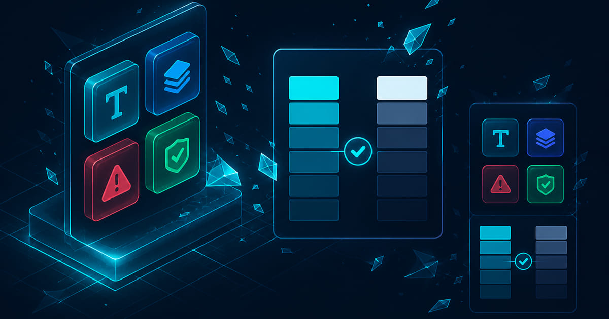
A poster palette is not a UI palette. Interfaces need semantic roles — background, surface, text, border, accent, danger — mapped to values that survive hover states, focus rings, charts, and a second theme. Accessible brand colours are not a compromise on the brand. They are how the brand survives a form, a button, and a phone in sunlight.
Semantic roles before swatches
Start with roles, not favourites. Roles describe jobs. Swatches describe paint.
A minimum viable interface palette:
| Role | Job |
|---|---|
| `background` | Page canvas |
| `surface` | Cards, panels, modals |
| `text-primary` | Body and headings on default surfaces |
| `text-secondary` | Meta, hints, captions |
| `border` | Dividers and input outlines |
| `accent` | Primary actions and links |
| `accent-hover` | Pressed/hovered accent |
| `danger` | Destructive actions and errors |
| `success` | Confirmations and positive states |
| `focus` | Keyboard focus indicator |
Map brand colours into roles — do not dump five marketing swatches into CSS and hope components sort themselves out. The hero gradient can stay marketing. The product needs stable tokens.
If you already have a brand kit, the interface system extends it. Core brand hues become accent and accent-hover. Neutrals become background, surface, and text. The slide deck and the app share a source file — not a screenshot someone eyedropped in week six.
The contrast pairing gate
A colour system ships when pairings pass contrast requirements — not when the board likes the gradient.
For each surface, document approved text and icon pairings:
- Body text on background — target WCAG AA minimum 4.5:1 for normal text
- Large headings — 3:1 where applicable
- UI components and icons — 3:1 against adjacent colours
- Accent on surface — button label on accent fill, not only white on hero blue
Run the gate on real components: primary button, secondary button, disabled state, error banner, link in paragraph text. Marketing mockups lie. Components tell the truth.
Contrast pairing test — audit these routes before handoff:
1. Default button — label on fill, fill on surface 2. Text link inside body copy 3. Error message on surface and on tinted error background 4. Placeholder and label on input border 5. Chart series on white and on tinted surface
Any fail blocks release. Fix the value or change the role assignment. Do not ship "brand exceptions" that become permanent debt.
See W3C — WCAG 2.2 Contrast (Minimum) and the WebAIM Contrast Checker for measurable thresholds. Accessibility is conversion work — a form nobody can read is not a lead. It is a bounce.
Dark mode is a second system
Dark mode is not light mode with inverted hex values. Photographs, shadows, and saturated accents behave differently on near-black surfaces.
Build a parallel mapping table:
| Role | Light value | Dark value | Notes |
|---|---|---|---|
| `background` | Often not pure black | ||
| `surface` | Elevate with lightness, not only borders | ||
| `text-primary` | May need off-white, not #FFFFFF | ||
| `accent` | Saturated accents often need desaturation | ||
| `border` | Subtle separators, not hairlines that vanish |
Test charts and data visualisation in both themes. A series palette that reads on white may collapse on charcoal. Semantic roles help: `chart-1` through `chart-6` mapped per theme, not six pretty colours from the brand slide.
Respect `prefers-reduced-motion` and system theme where product policy allows. Forced dark without a tested mapping is how focus rings disappear and error red becomes mud.
Data viz, states, and the colours marketing forgot
Interfaces spend more time in states than in hero sections. Document:
- Hover, active, disabled for buttons and links
- Selected and unselected for tabs and filters
- Error, warning, success backgrounds and foregrounds
- Skeleton and loading neutrals that do not flash bright white in dark mode
Data visualisation needs a sequence distinct from UI accent. Do not reuse the primary brand blue for every series. Colour-blind-safe sequences are a product requirement, not an optional appendix. IBM — Designing for color blindness is a practical reference for multi-hue and pattern strategies.
Publish tokens in a format engineering can import — CSS variables, JSON, or a shared design token file. Names travel. Hex pasted in Slack does not.
Document the colour space you standardise on — sRGB for web is the default assumption. If print and screen must match a hero hue exactly, say so in the spec and accept that most UI surfaces will still be judged on contrast, not on ink parity.
What you can spec alone — and when to bring in build
You can define roles, pairings, and a light/dark table in a spreadsheet before a full redesign. Bring in web design and development when tokens must land in a component library, when marketing and product share one codebase, or when contrast failures keep blocking release.
The logo and branding kit establishes core values and print-safe rules. A full website build is where semantic tokens meet real routes — forms, checkout, dashboards, not only the homepage hero.
CLICK.BLUE has mapped brand colour into shippable interface systems since 2014 — twelve-plus years, fifty-plus businesses, a hundred-plus websites. We treat contrast and dark mode as part of identity, not a QA surprise at launch.
If the slide palette works in decks and fails on buttons, you need roles and a pairing gate — not another swatch. Ask for a scoped colour system. Ship pairings that survive the form.