Key takeaways
- Brand equity lives in recognition. A refresh keeps the shape customers already know.
- A full redesign is justified when the business, audience, or category has materially changed.
- Migration risk — signage, favicons, uniforms, legacy PDFs — belongs in the brief before ink dries.
The board wants to look modern. The truck still wears the mark from 2011. Customers spell your name correctly because of that awkward ligature you now hate. A designer sends three radically new directions. Nobody asked whether recognition or reinvention is the job.
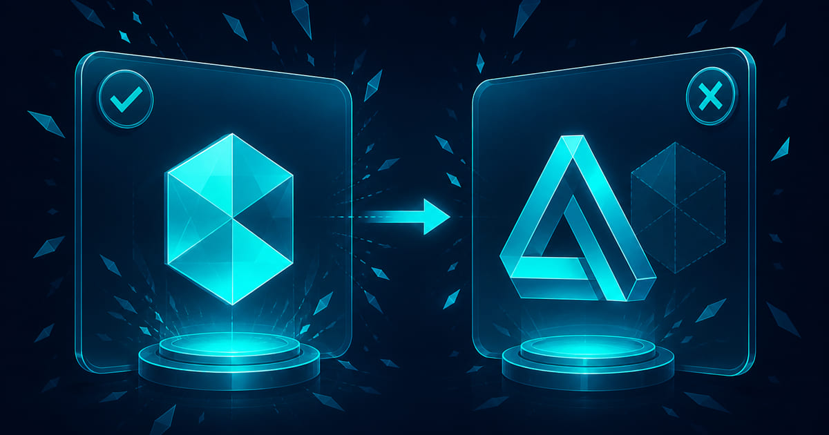
Logo redesign vs logo refresh is an equity decision, not a taste contest. A refresh tightens what already works — proportions, weight, colour, legibility on a phone. A redesign replaces the symbol when the business has outgrown the story the old mark tells. Refresh protects memory. Redesign spends it on purpose.
A guide to crafting the perfect logo covered what a strong mark needs at birth. When you need a brand kit named the system around the mark. This page is the fork before you fund the wrong project.
What equity actually is
Equity is the accumulated recognition that lets someone pick your product off a shelf, spot your van in traffic, or trust an email because the header looks right. It is not sentimental attachment to outdated taste. It is an asset with a replacement cost measured in years of impressions.
Signs you have equity worth protecting:
- Customers describe you by the symbol, not only the name
- The mark appears on physical assets with long life — vehicles, uniforms, packaging
- Search and social autocomplete assume the current visual
- Partners and resellers use your lockup in co-marketing
Signs equity is weak or negative:
- The mark never reproduced cleanly — embroidery, favicon, app icon all fail
- The business pivoted category and the symbol contradicts the offer
- Merger or name change broke the link between word and picture
- The current logo was a placeholder that became permanent
Weak equity lowers the cost of redesign. Strong equity raises the cost of throwing the mark away.
Refresh: same story, sharper execution
Choose refresh when:
- The business model and audience are stable
- Recognition is an asset, but execution is dated — gradients, thin strokes, illegible small sizes
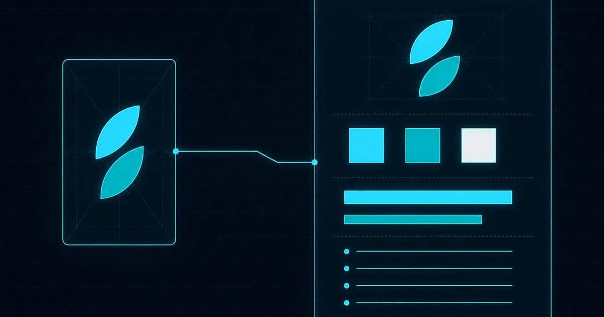
- You need digital-ready files, clear space, and colour variants without changing the silhouette
- Migration surface is large and timelines are tight
Refresh work typically includes:
- Simplified geometry for small sizes
- Updated colour values with accessible contrast pairs
- Revised wordmark kerning and weight
- File suite — SVG, PNG, reversed, monochrome
Fair limitation: refresh cannot fix a symbol that means the wrong thing. Polishing a scissors icon when you now sell cloud software is makeup.
Redesign: new story, planned migration
Choose redesign when:
- Name change, merger, or category shift requires a new mnemonic
- The mark is indistinguishable from competitors in your aisle
- Legal or trademark pressure forces departure
- Research shows recognition attaches to a business you no longer run
Redesign demands a migration plan, not only a reveal deck:
| Touchpoint | Owner | Lead time | Notes |
|---|---|---|---|
| Website favicon and OG | Web | Day zero | Cache bust |
| Google Business Profile | Marketing | Week 1 | Photo updates |
| Vehicle fleet | Ops | Months | Phased wrap schedule |
| Email signatures | All staff | Week 1 | Template push |
| Partner co-brand PDFs | Sales | Quarter | Version archive |
Skipping the table is how you run two logos for a year and train customers to ignore both.
Reproduction audit before you choose
Test the current mark honestly:
1. Favicon 32×32 — readable? 2. Embroidery sample — holds detail? 3. One-colour invoice header — still distinct? 4. Avatar crop on LinkedIn — recognisable without the wordmark? 5. Billboard mock at distance — same question
If refresh fixes most failures, redesign is probably theatre. If the mark fails every small-size test and the story still fits, refresh is engineering. If the story does not fit, redesign is strategic.
Recognition and migration-risk test
Run before you approve directions:
Recognition test
Show the current mark for two seconds to ten people who match your customer — not only staff. Hide the name. Ask what company or category they recall. Repeat with refined options. A refresh should score equal or better on name recall. A redesign may score lower at first — budget for re-education.
Migration-risk test
Score each touchpoint 1–5 on cost and visibility. Sum the score. Above your threshold, default to refresh unless strategic change is documented in writing.
Change narrative
Write one sentence staff can say: why the mark changed, what stayed familiar, when assets update. Without the sentence, redesign becomes rumour.
Fair to both paths
Refresh is not "cheap redesign." It is disciplined conservation of an asset. Redesign is not vanity. It is appropriate when the old symbol lies about what you sell.
Do not redesign because a rebrand agency needs a hero image. Do not refresh because leadership is afraid of a town hall. Match the depth of change to the depth of business change.
The USPTO trademark basics guide and WIPO brand identity resources are useful references when equity and legal clearance intersect — not legal advice, but a reminder that marks are assets with paperwork, not only pixels.
What you can run in-house
You can run the reproduction audit and migration table this week. You can survey recognition with a simple hallway test — better with real customers.
You should not redraw a trademark-sensitive mark without vector craft and clearance workflow. You should not roll out fleet wraps before digital assets and favicons are ready — the web is where confusion spreads fastest.
CLICK.BLUE branding work includes the logo and branding kit — mark, variants, and the files teams actually use. Twelve-plus years, fifty-plus businesses, a hundred-plus websites taught us that the expensive logo project is the one that skipped migration math.
Start with the reproduction audit. We will tell you refresh, redesign, or wait.